|
Scatter plots show the relationship between two variables
by displaying data points on a two-dimensional graph. The
variable that might be considered an explanatory variable
is plotted on the x axis, and the response variable is
plotted on the y axis.
Scatter plots are especially useful when there is a large
number of data points. They provide the following
information about the relationship between two variables:
-
Strength
-
Shape - linear, curved, etc.
-
Direction - positive or negative
-
Presence of outliers
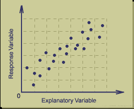
A correlation between the variables results in the
clustering of data points along a line. The following is
an example of a scatter plot suggestive of a positive
linear relationship.
Scatterplot Smoothing
Scatter plots may be "smoothed" by fitting a line to the
data. This line attempts to show the non-random component
of the association between the variables.
Smoothing may be accomplished using:
The curve is fitted in a way that provides the best fit,
often defined as the fit that results in the minimum sum
of the squared errors (least squares criterion).
The use of smoothing to separate the non-random from the
random variations allows one to make predictions of the
response based on the value of the explanatory variable.
Cause and Effect
When a scatter plot shows an association between two
variables, there is not necessarily a cause and effect
relationship. Both variables could be related to some
third variable that explains their variation or there
could be some other cause. Alternatively, an apparent
association simply could be the result of chance.
Use of the Scatterplot
The scatter plot provides a graphical display of the
relationship between two variables. It is useful in the
early stages of analysis when exploring data before
actually calculating a correlation coefficient or fitting
a regression curve. For example, a scatter plot can help
one to determine whether a linear regression model is
appropriate.

|